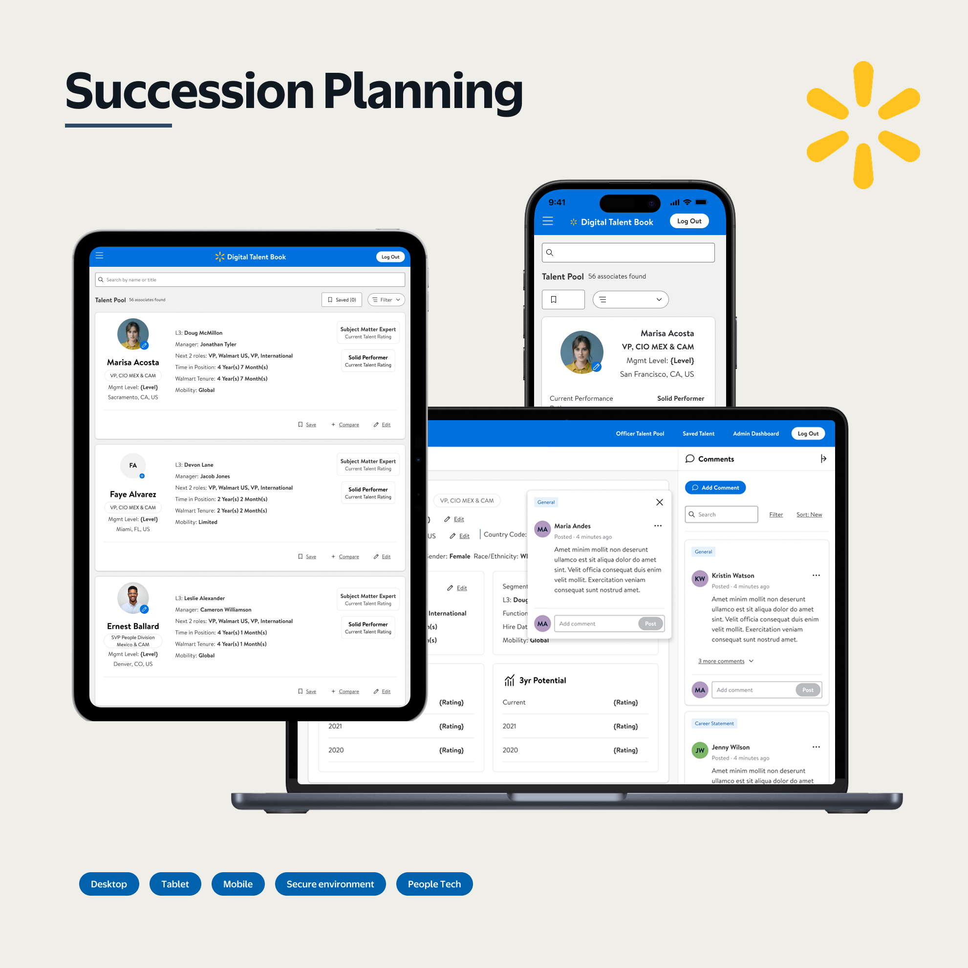
Succession planning at Walmart was considered the company's most valuable asset — and executives had stopped using the tool for it. HR leaders had reverted to assembling physical talent books by hand: 200 hours of manual preparation per review cycle, just to discuss who should lead the organization next. Institutional knowledge about high-potential employees and subject matter experts was getting buried in inboxes and printed binders.
Research with senior directors and officers surfaced two things that mattered most: the primary users weren't at their desks when they reviewed talent data, and a more organized view of their people was immediately credible to them — more so than what they were seeing in Workday. The platform hadn't been designed for how this work actually happened.
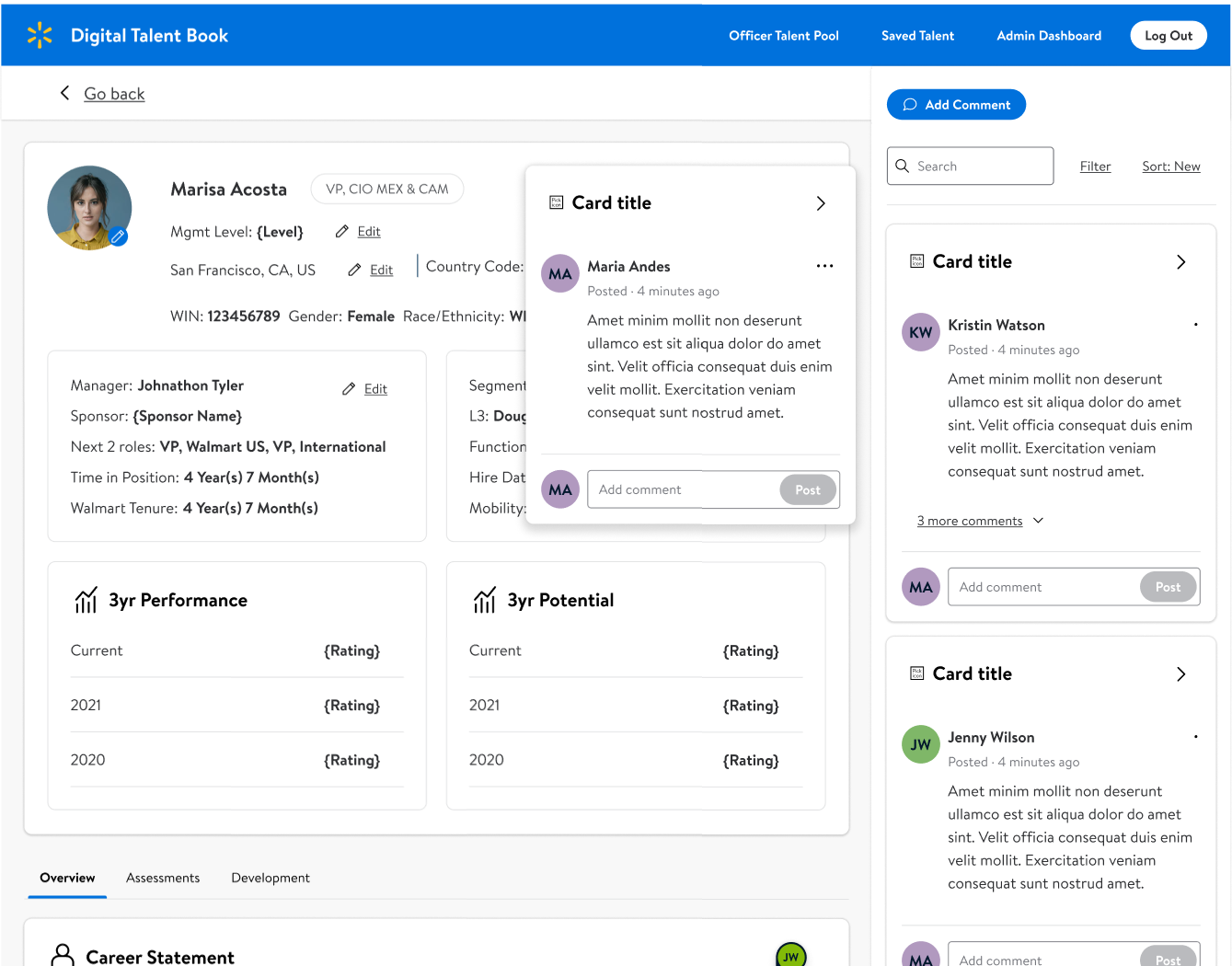
The design delivered what the platform had never had: tablet-responsive layout, Living Design alignment, and full accessibility compliance. None of that was accidental — it came directly from two research findings: the primary users weren't at their desks during review cycles, and organized data was immediately more credible to them than what Workday showed. The ambition of the post-launch targets reflected how much the organization believed the design had addressed the right problems: 80% reduction in 200-hour prep cycles, succession slate coverage from 55% to 100%, cross-segment officer mobility from 3% to 25%.
The platform was redesigned around how succession review actually happens — on a tablet, away from a desk, by leaders who need organized data they can trust at a glance. Tablet-responsive layout, Living Design alignment, and full accessibility compliance each came from research, not a checklist. The 200 hours of manual prep per review cycle existed because the previous tool couldn't do what this one was built to do.